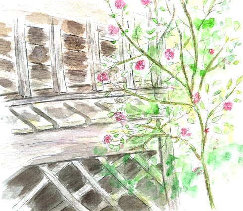
I realized that my quick strokes for the siding on the porch were heading in the wrong direction ... so I corrected these and darkened the values. Still not sure they're dark ENOUGH! But I sure can see that I've overworked portions of the porch ... SIGH!
6 comments:
Okay, I'm looking at both porches and can't see what you did wrong! I can see the darkened values but looks fine to me.
I love how the pretty flowers frame the porch-looks like a great place to enjoy.
I can't see the differences, perspective-wise, either! You did a fantastic job on both--I prefer the clearer tones of the first one, I think.
Very nice. I like the light, airy look of the tree with blossoms.
I can't see the difference either. Both look 'right' to me. The difference is mainly in the amount of contrast, either of which looks great. Aren't we always our harshest critics!!!
Lin,
Like Teri, I don't see the error. Both are lovely drawings.
Lin,
I thought that I would tell you, I love your avatar. I don't generally care for childerns pictures in the avatar but yours is an exception, you look like a little director in a directors chair. It cracks me up!
Post a Comment